BRAND
Branding to remove woo woo factor was essential, when launching boutique yoga studio - Golden Yogi - on Takapuna’s North Shore. This project included competitor research, brand strategy, logo design, website design, digital design, social media, partnership affiliation programmes, promotional collateral, events and much more.
Brand
Whether we like to admit it or not, our brand is what others think about us.
It is not limited to the colours we use, or the logo, or fonts - although these things must be used consistently for maximum visual impact and a sense of consistency. But it goes deep than that. It’s the tone we use, and the way we inspire the world that creates the biggest brand touchpoint of all. When we can leave an imprint on someone’s soul, via a motivating stat or a memorable story - then that is when we all win.
A good brand should make people’s life better. Make them feel like they found their tribe. And help them feel part of something bigger than themselves. Robust brand guidelines, or rebrands, bring the team along with a united vision of: values, audience, and aesethetic. Which is why more than anything I love my role as a ‘Brand Keeper’ and creator - ideally working on brands that are community driven such as:
“Kirsty is the marketing genius, while Erin is the yogi and meditation expert.”
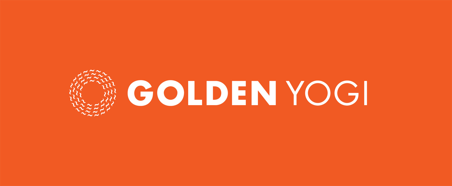
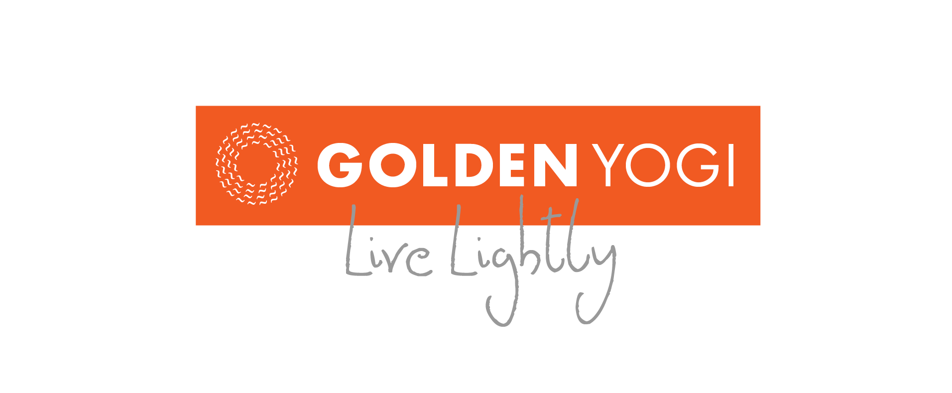
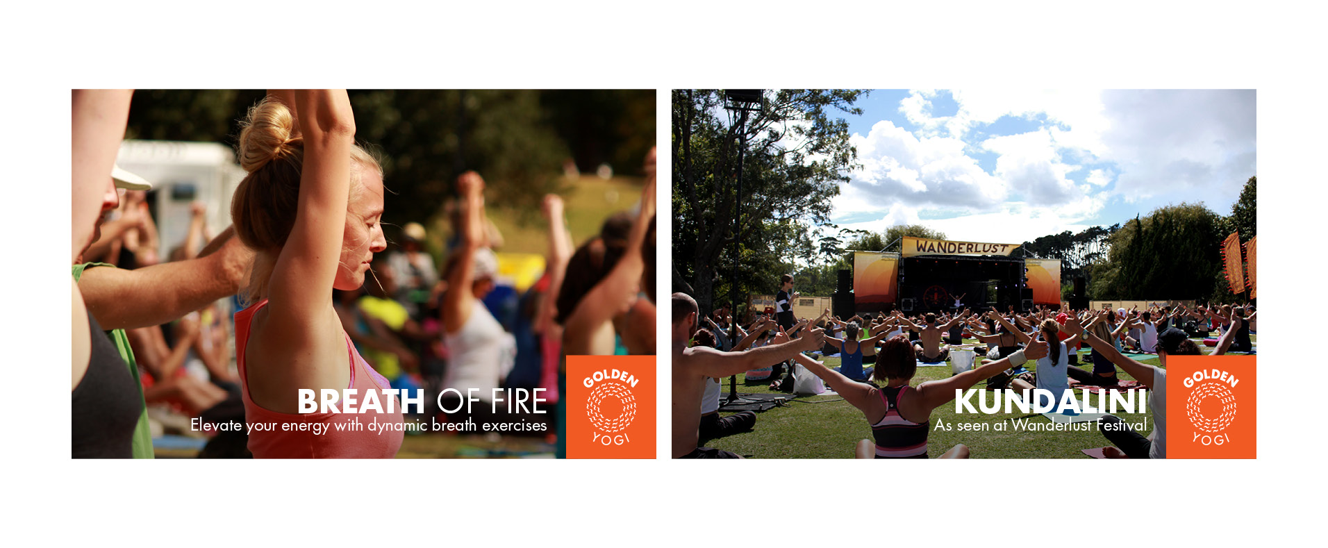
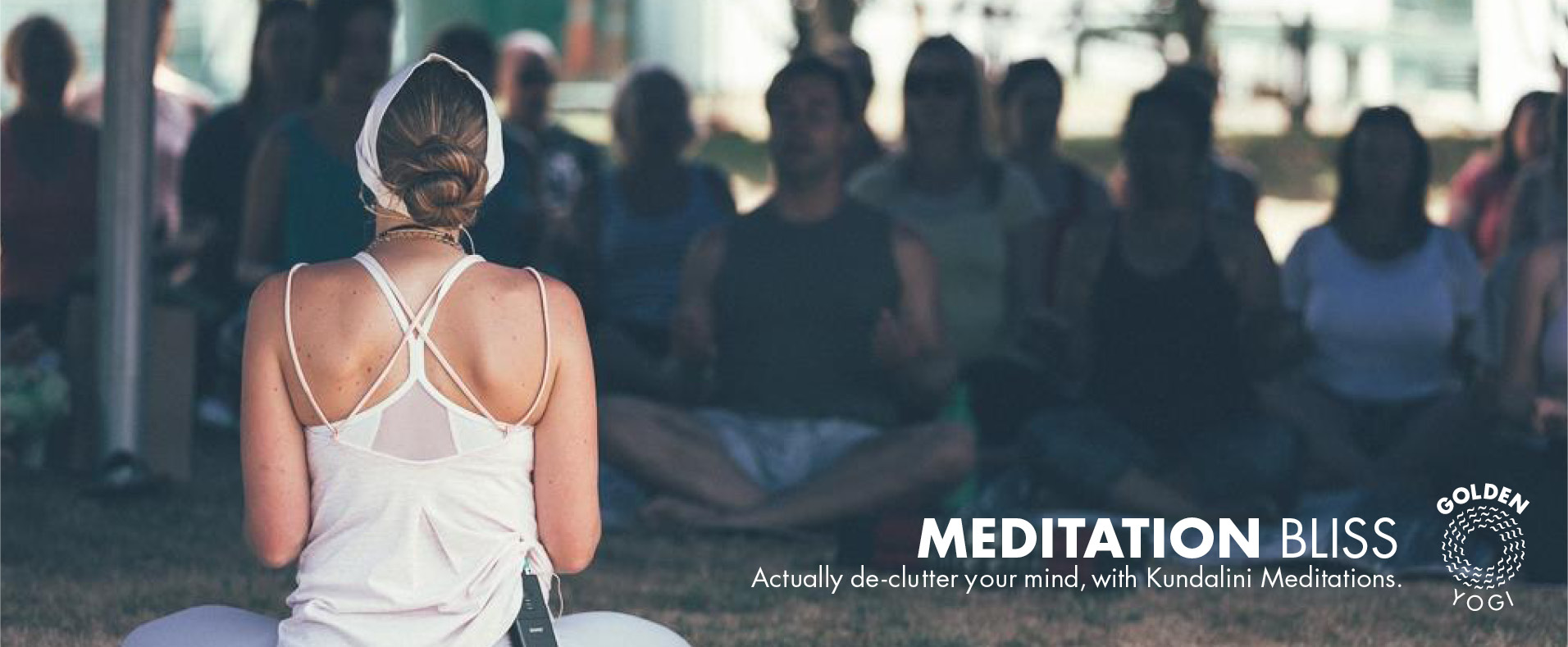
GOLDEN YOGI Start-up Case Study
The biggest challenge when launching a wellness centre, and introducing new forms of yoga to New Zealand, was in establishing trust and reducing the woo woo factor. To overcome this an inviting, contemporary, playful brand identity was born. People new to yoga and fitness would comment that they maybe wouldn’t have come if they didn’t find the brand so inviting.
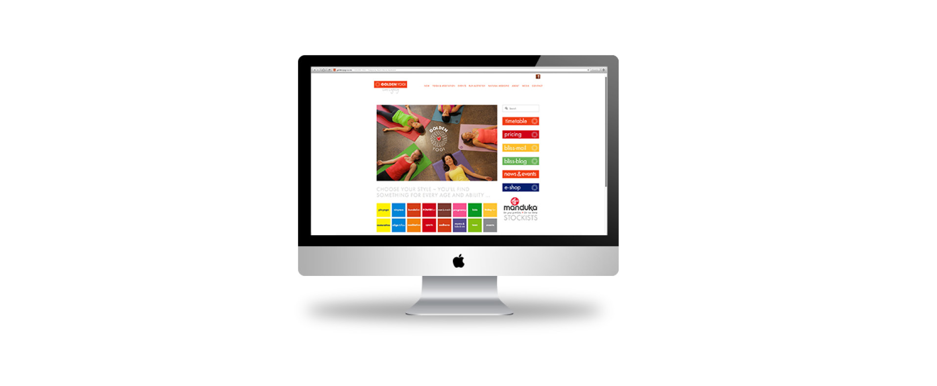
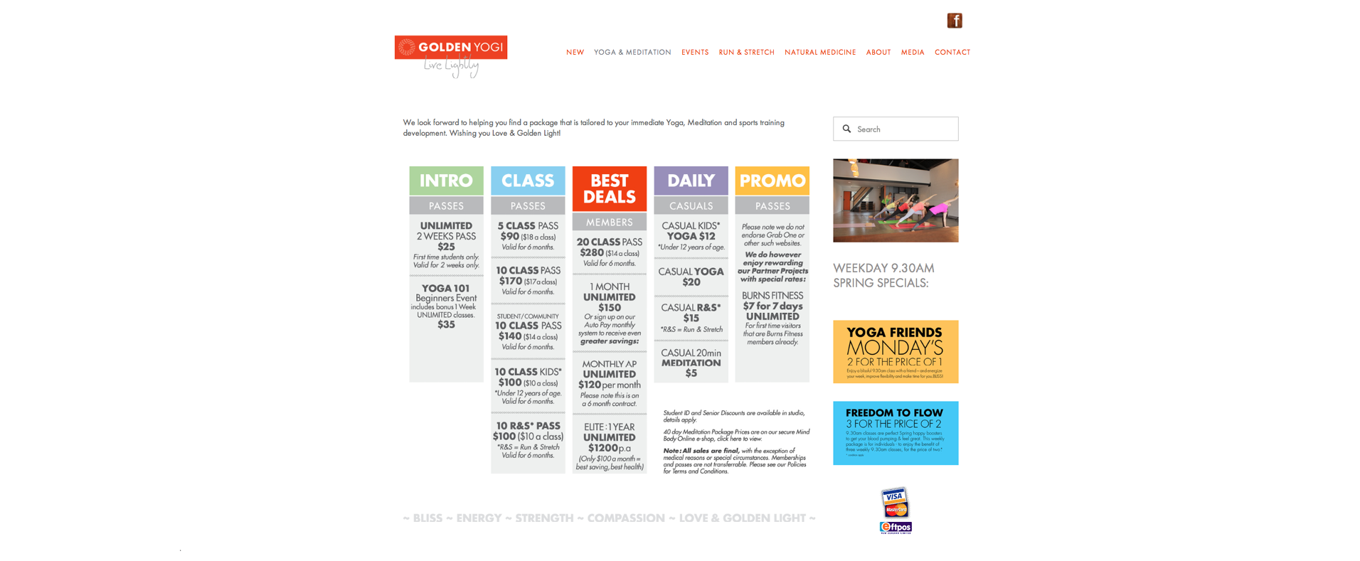
This branding project included: brand identity, logo design, website design, copywriting (print and web), SEO, Mindbody Online software integration, partnership collateral, event design and designing Golden Yogi brand guidelines.
Execution included: printed flyers, timetables, digital content; social media; e-newsletters; events; event photography; ambassador partnerships; affiliate promotions; Media and PR.
WEBSITE: http://goldenyogi.co.nz/
FLINT WEALTH Start-up Brand Application
Working on the Flint Wealth brand invited a playful approach to help make finance feel accessible, approachable and modern. If finance had a personality, then this one was the cool uncle that you go to for advice and inspiration.
Partnering with over 100 different managed funds, meant we needed to find ways to not only evolve the initial brand logo and initial ideas from Dear Future to make sense across various collateral, but we also needed to evolve the brand application to work in a way that we could feature our partners in a way where their logo and colour-ways didn’t look out of place alongside our more contemporary finance vernacular.
Given we were a fast-paced fintech startup, we didn’t have the luxury to sit down for months and plan out our design systems - so instead we took the initial brand guidelines and updated them as we grew. For many brands that are young or growing quickly, this is a great skill to have at the table - and keeping these skills in-house meant we understood where we were heading without being tied in to any sunk cost bias.
The end result was a typographical brand that was fun to be a part of.

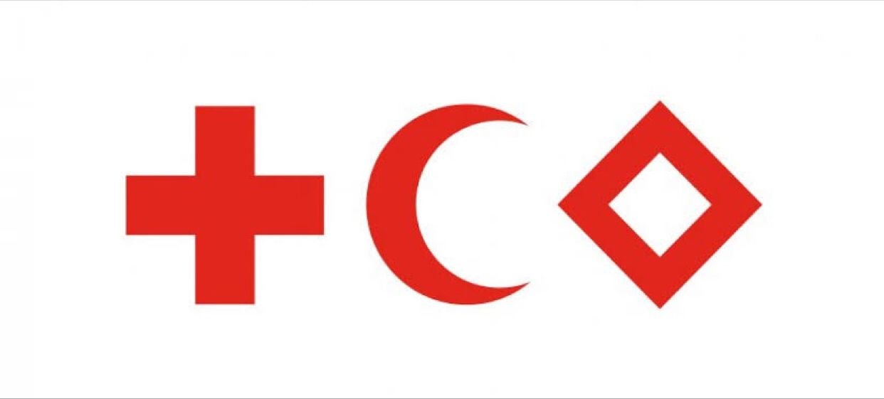
RED CROSS Brand Experience
Given I was not yet born back in 1863, when Red Cross was founded, I have to give the initial brand development credit to Henry Dunant and the International Committee of the Red Cross - however working on such a robust brand with extensive 85 page long guidelines was an absolute treat.
At it’s core, the logo itself says ‘please don’t shoot me’.
And on a more commonly known level, the brand itself is a beacon of hope for people who are struggling. It urges people all over the world to come together to provide humanitarian aid that stands on 7 fundamental principles.